IMPORTANT DESIGNING INFORMATION
Recommended Requirements for Clear Phone Designs
Creating high-quality Clear phone case designs ensures the best possible print results. To achieve optimal results, please follow these recommended guidelines:
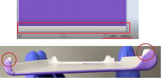
| Dimensions | 892 x 1789 px, may vary between models |
| Resolution | 300 DPI (Pixels/Inch) |
| File extension | .PNG or .JPEG / .JPG |
| Color Space | RGB |
| Color finish | Matte |
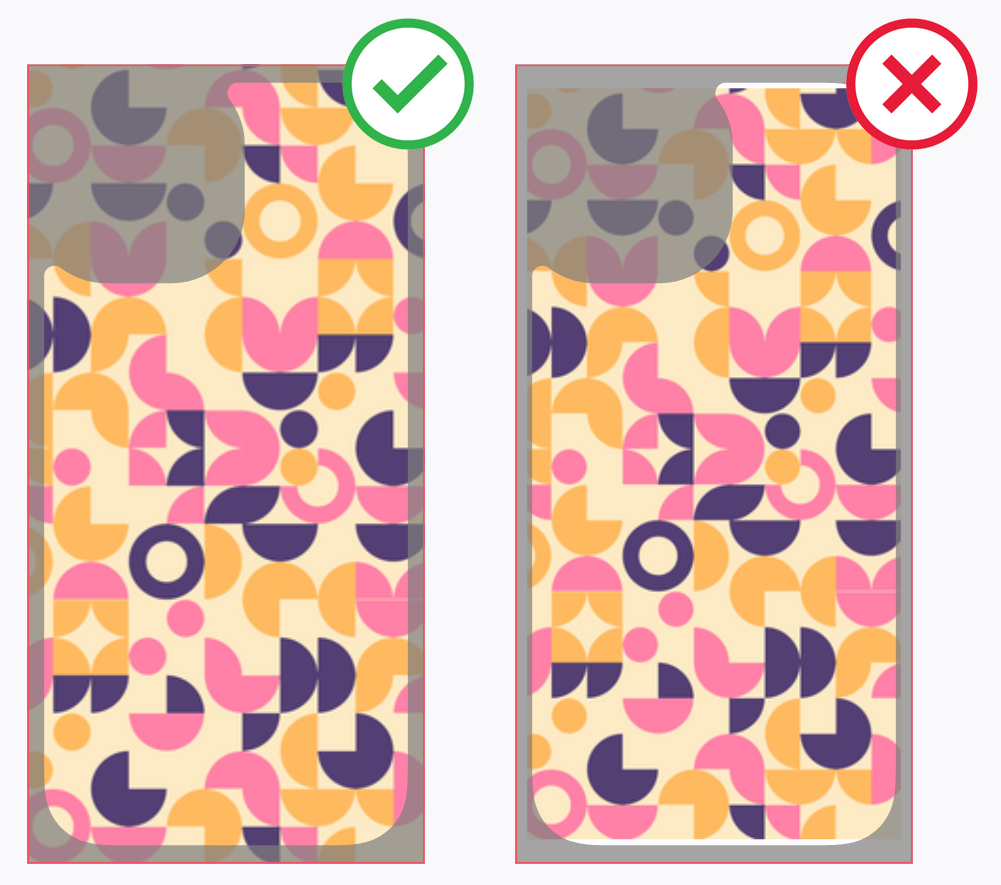
Ensure Full Design Coverage
To avoid blank spots on the final product, always cover the entire design area with your images.
⚠️ If your image does not fully extend to the edges of the template, parts of the phone case may remain unprinted, affecting the final look.
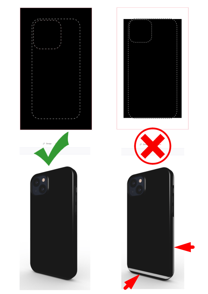
Pro Tip: If your design doesn’t cover the whole area and you don't want to scale it up (to avoid cutting off important parts). Try using a "Mirror effect" on the sides to extend the design and cover the edges of the guidelines.
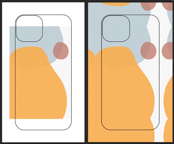
Printing Safe Area
- Check that all important elements of your design stay within the safe area.
- Fill the entire layout area (red rectangle), including the bleed area.
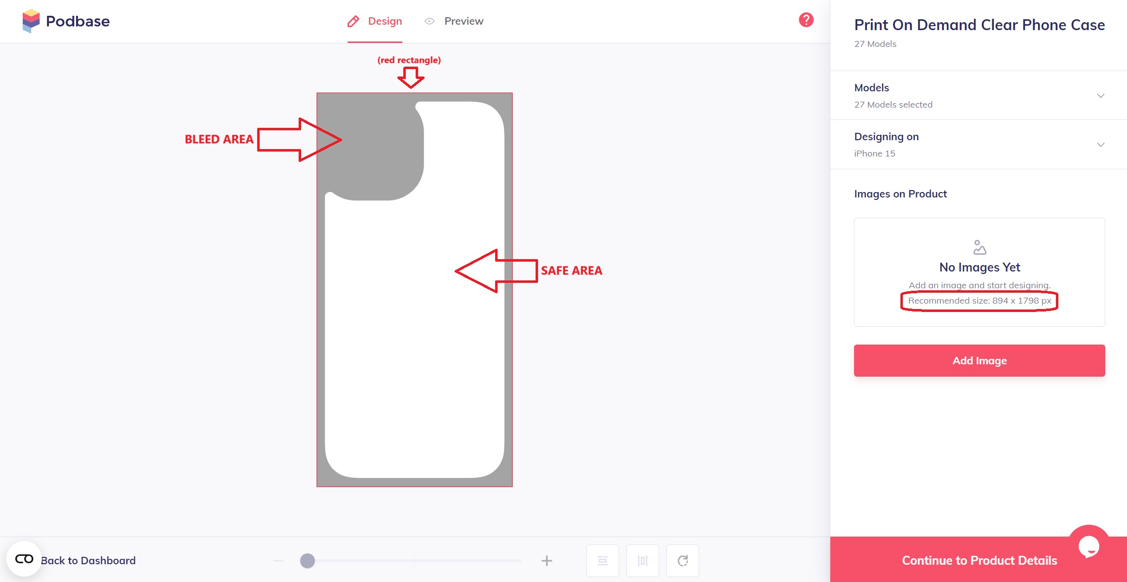
For precise alignment, use our layout files that combine safe zones for all phone models into one convenient file:
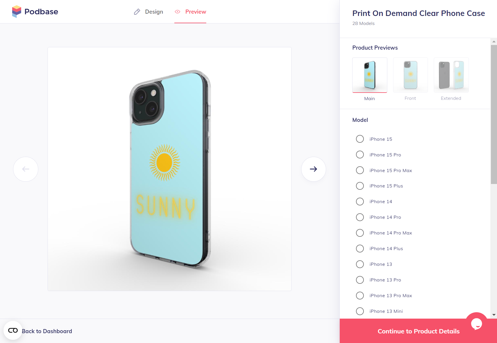
Previewing Your Design on Different Models
You can always check how your design will appear on specific phone case models in two ways:
- On the Podbase platform: When creating a product, navigate to the "Designing On" tab. Click on different phone case models, and the design guidelines will automatically adjust based on the selected model.

-
You can also check how your design will appear on specific models by downloading the .PSD file template from:
- Google Drive (filled with all templates and mock-ups)
- Your dashboard under the selected product description.

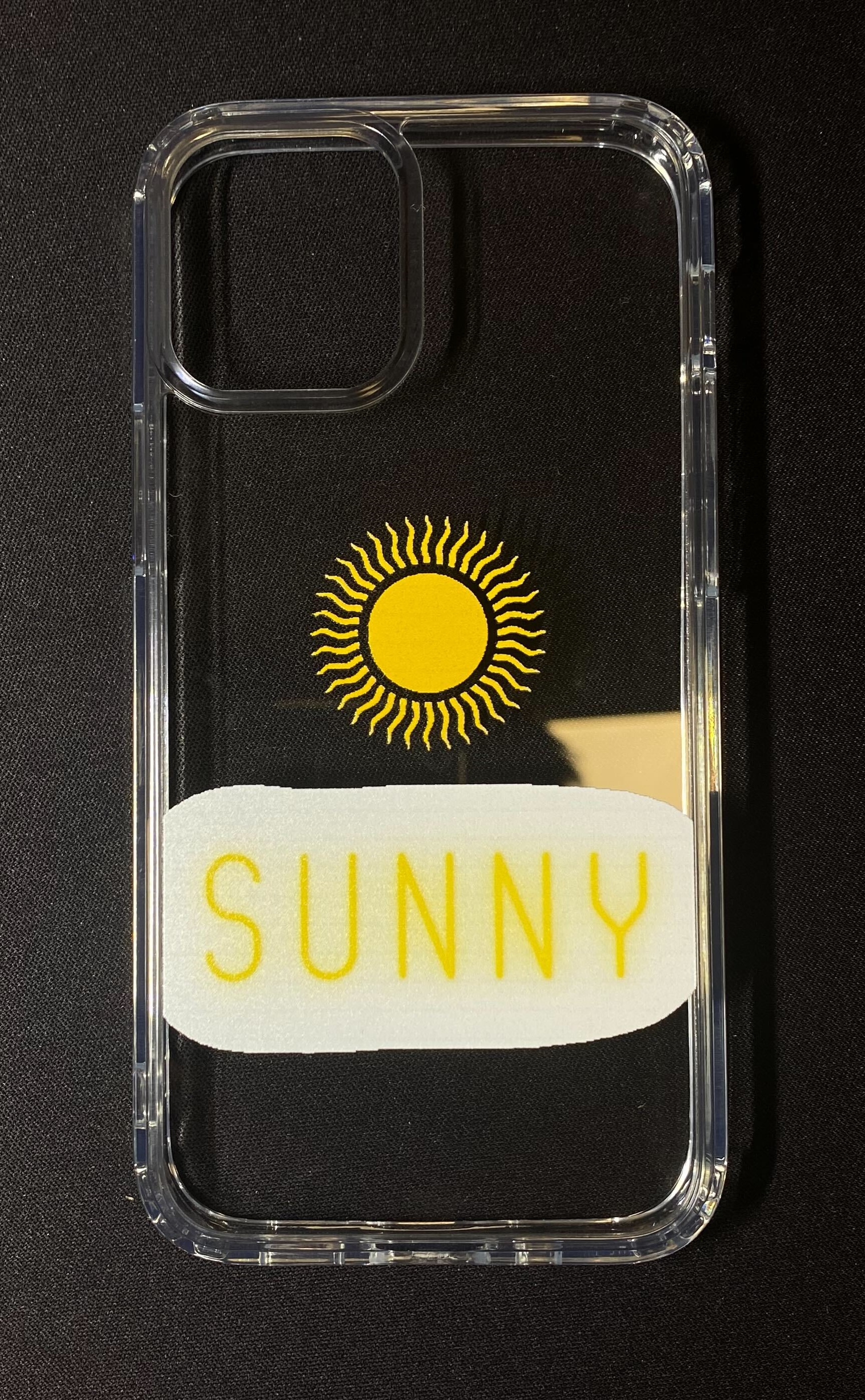
Logo Placement on Phone Cases
For the best results on every phone case model, position your brand logo approximately 40mm, or 475px, from the bottom edge. This placement, illustrated in the reference photo, keeps your logo clearly visible across all device variations.

If you're aiming for a universal design that works across all phone case models, we do not recommend placing your brand logo in the center or near the camera cutout. On models like the Samsung Z Flip series or phones with larger camera modules, such as the Xiaomi 13T, your logo may be partially cut off.
This would require additional adjustments to adapt the design for all models effectively.![]()
ADVANCED INFORMATION
IMPORTANT: Real-Life Design Calibration
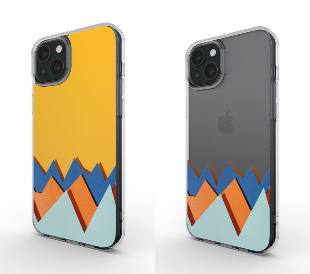
When adjusting your design for a real-life match, always refer to the DESIGN page. The PREVIEW page is a 3D mockup intended for visualization and product listing creation. While useful for presentation, it may have slight inaccuracies compared to the final printed phone case.

.png?width=670&height=620&name=image%20(52).png)
Key Design Considerations
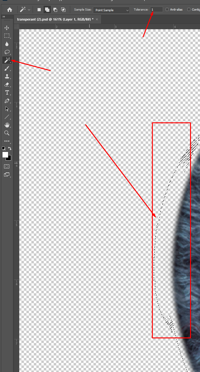
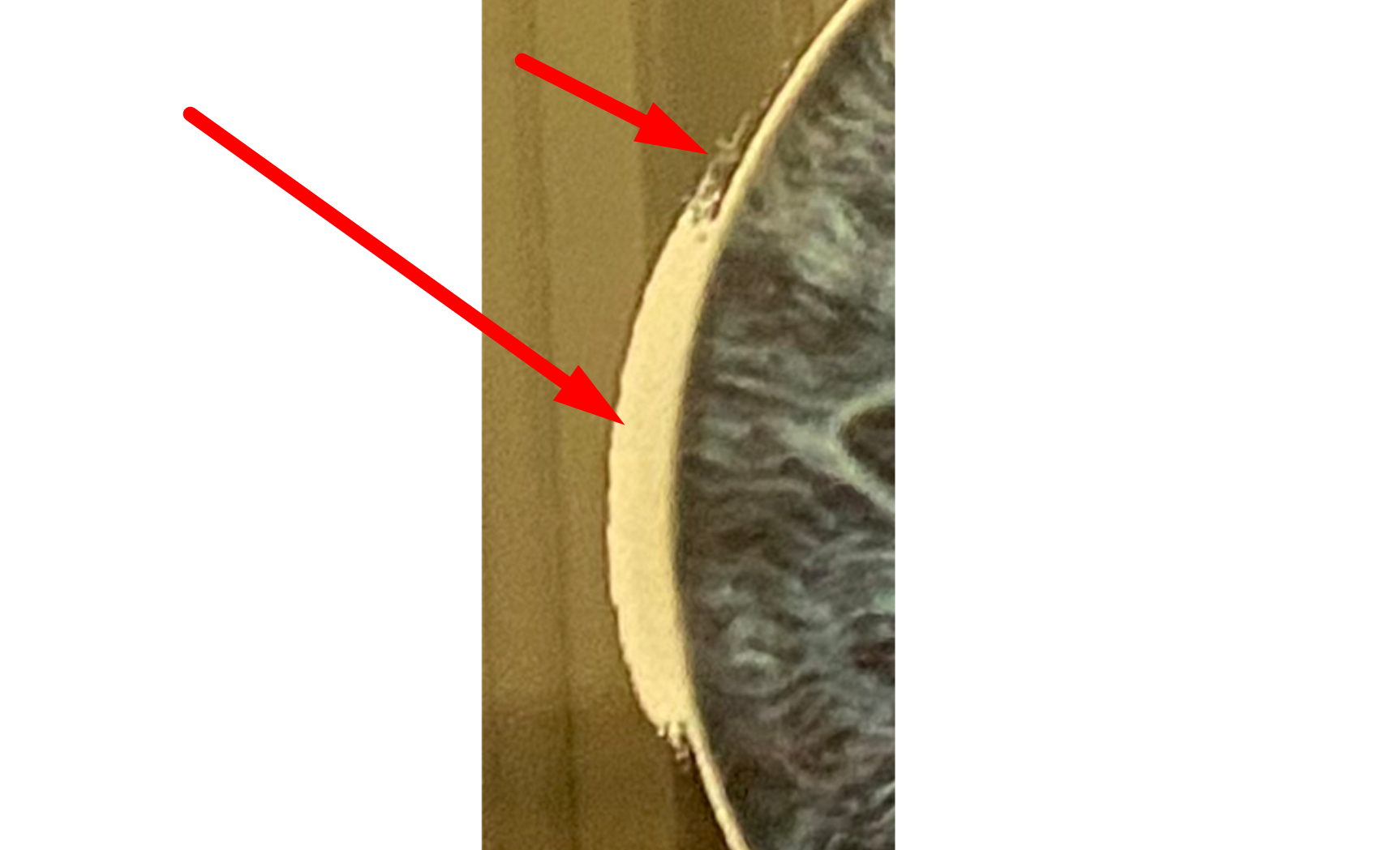
Ensure that the clear areas are 100% transparent; otherwise, the printer will print white over them. The printing process starts with applying white ink on the phone case, followed by other colors. Here’s how to check for pixels that might not be visible:
a. Bad print example: If there are not 100% transparent pixels, you might see white next to the objects when it should only be under them.
b. Another bad print example: If you try using a shiny gradient effect on the letters, you might see extra pixels around the letters using a pixel tracking tool (like Photoshop’s Magic Wand).
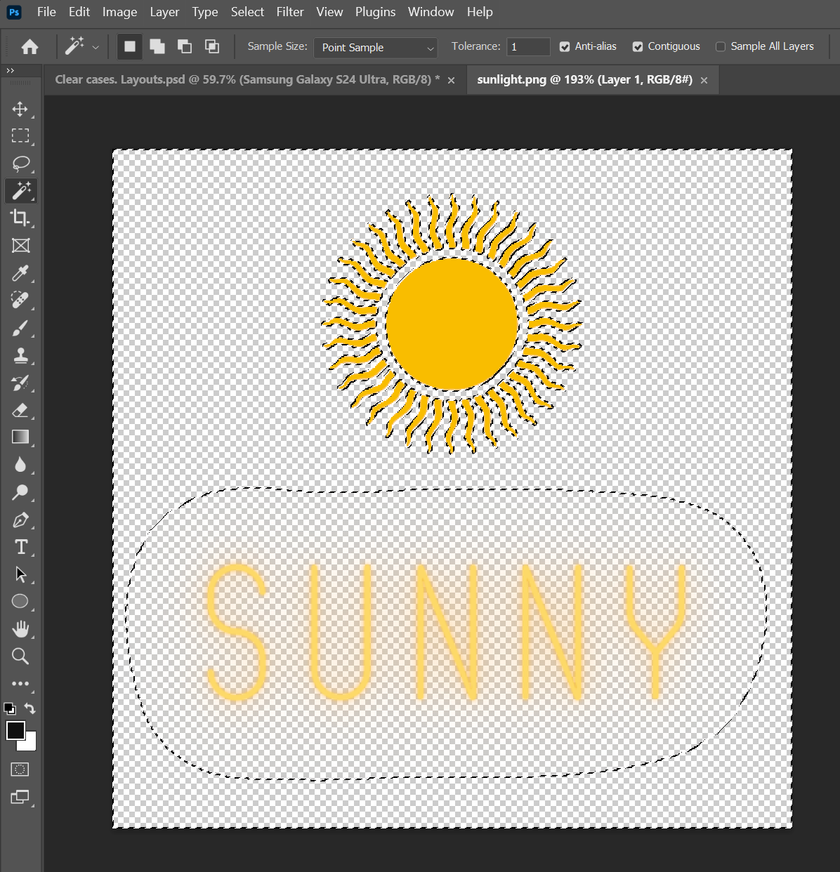
Remember, the printing process starts with white ink, so any nearly transparent pixels will end up with white underneath them, leading to an undesired final result. To avoid this, cut out objects cleanly when creating your design or use a solid background.
Once you've created the designs for your desired models, go to File > Export > Artboards to Files. Select the destination and file type: PNG-24.
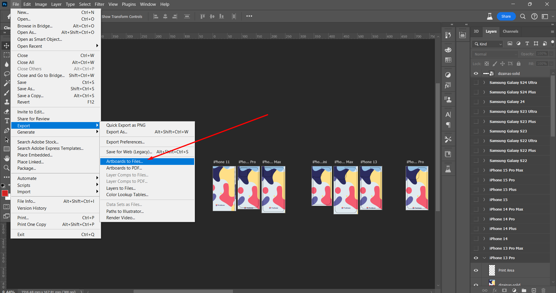

Voilà! You’ve successfully created perfect designs for each model.:
Avoid using neon RGB colors
The printing process uses CMYK, meaning neon RGB colors may not be accurately reproduced. If your design includes neon shades, they may appear less vibrant when printed. Always preview how your colors convert to CMYK before saving it as RGB to minimize color discrepancies.
